David Hockney redesigned tabloid The Sun’s logo, may have spectacularly trolled them
It wasn't the most painstaking of redesigns

For free real time breaking news alerts sent straight to your inbox sign up to our breaking news emails
Sign up to our free breaking news emails
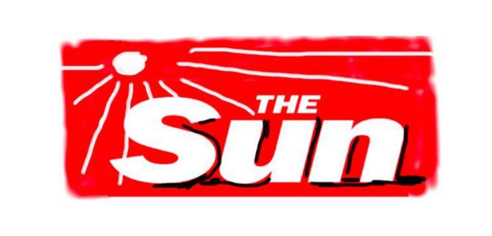
David Hockney is best known for his paintings of hollow LA suburbs and vivid Yorkshire landscapes, but his latest work is an iPad drawing of the logo for The Sun.
The tabloid’s usual masthead will be replaced by Hockney’s redesign on the front page of every 3 February issue, billed as a ‘special one-off edition’.
At first, this seems like a pretty bizarre publication - notorious for many odious Katie Hopkins columns - for the artist to align himself with, but the design suggests he perhaps didn’t take the assignment that seriously.
Hockney has created using an iPad before, but usually comes up with something a little more delicate than The Sun redesign, which looks very MS Paint circa 1997.
His accompanying statement could certainly be read as somewhat sarcastic:
“I was delighted to be asked. Once I thought about the idea it didn’t take me long. The sun and The Sun. I love it.”
Subscribe to Independent Premium to bookmark this article
Want to bookmark your favourite articles and stories to read or reference later? Start your Independent Premium subscription today.
Join our commenting forum
Join thought-provoking conversations, follow other Independent readers and see their replies