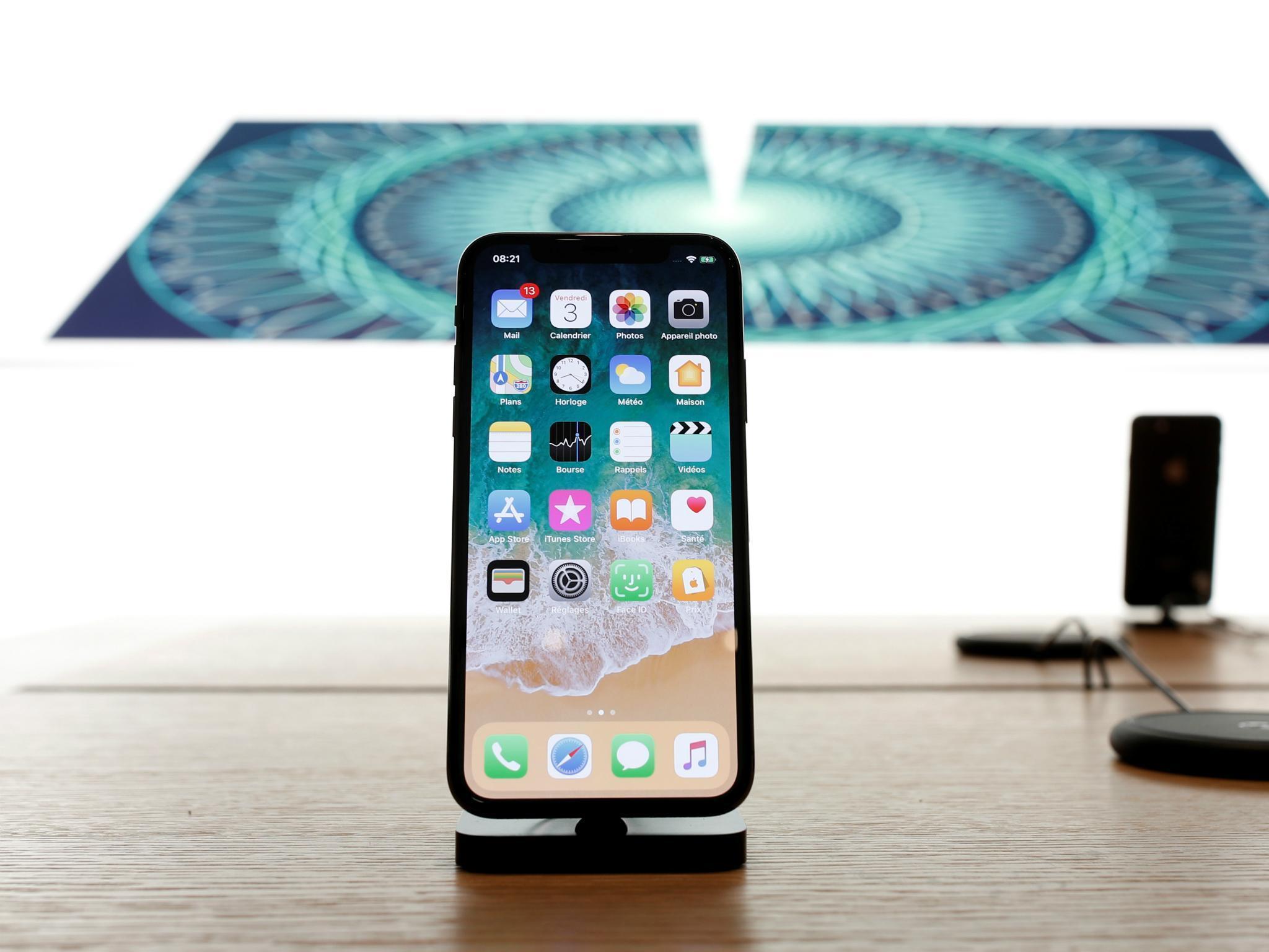
iPhone X: Apple explains how its futuristic new handset was released — and the truth behind the controversies
Craig Federighi explains why Touch ID had to be replaced

Sign up to our free weekly IndyTech newsletter delivered straight to your inbox
Sign up to our free IndyTech newsletter
The Apple iPhone X is flying off the shelves. Two weeks before Apple’s flagship handset went on sale, I sat down to a rare on-the-record session with senior Apple execs to hear about how the phone came about, why no Home Button is better and why there’s no Dark Mode.
There were two Apple executives in the room: Craig Federighi, SVP of Software Engineering and Alan Dye, VP of User Interface Design.
Apple has presented the iPhone X as the future. So I begin by asking how they came to decide that this was the future they wanted.
A long time coming
The process, Dye says, is, "Very iterative; we’re very much prototype-it-and-make-it to explore it. A lot of great things came together – the display and the design of the hardware really allowed us to think about this new fluid gestural UI. Multi-touch on the iPhone has been around for 10 years, people have got really comfortable with it, so we felt that this could be a really good time for change."
But the move towards an all-screen device has been the plan all along.
As Federighi comments, "There was a kind of inevitability about it. If you think about the first iPhone and how it distinguished itself from everything that had come before, it was a device that was dominated by the screen and dominated by multi-touch. Back then you would have looked at that first iPhone and said, my God, this thing is nearly all screen."
He’s right, compared to what was available then, the big screen on the first iPhone was certainly a game-changer.
"Our feeling was we were working toward a model where the screen became the whole experience. Taking that into consideration and thinking about how the Home Button has been such a beloved and successful element of the iPhone experience and thinking, how do you something even better than the Home Button. That was the crazy challenge we had to take on. But we knew it was coming and we were happy to arrive at something that we really feel is better than the Home Button."
iPhone X on sale across the world: in pictures
Show all 15And UX design isn’t just about our conscious response.
Federighi again: "I think we’ve achieved a level of spatial coherence to this design that ends up feeling natural at an intuitive level that is below your intellectual understanding of the interface. You find when you swipe up the cover sheet to an app and then you swipe that back to the Home Screen… it all just makes sense and feels natural. And we were able to achieve this in part because we had the performance in the hardware and with the touch system, to really just make it that fluid and coherent. I think it comes together really well."
The design of the phone was obviously one of the biggest challenges of the iPhone X, representing, as Dye says, "really, the biggest opportunity we’ve had," and as Federighi adds, "There was a lot of experimentation and it was thrilling when we came upon the design. There was a moment when the hardware prototypes came in and the software was finally functioning to spec and we were all carrying it and you just would see smiles on everyone walking around because it all came together in the way that we had hoped."
But, in my experience with the iPhone X, there was acclimatising to be done.
"It is the biggest adjustment in the experience but I think it comes pretty quickly," Federighi says. "Once you use it for a short time you realise like this is this is the way you wish you could always use the phone. It’s a wonderful interface. And we think it's a great path to the future."
Losing Touch ID
An all-over screen and Face ID means there’s no Home Button on the iPhone X and as a result you swipe up to go to the Home screen. But some people feel that means it’s slower than Touch ID. Federighi isn’t so sure.
"We made the lock image stand out here in terms of giving you comfort to knew whether it was locked but people sometimes think they have to wait for that lock to unlock before they can start using the device. Just raise it and swipe away. And if you go faster, then the device will just unlock. And that's really one of the things that's been especially great, the overall fluidity of the experience and the speed. So, don't wait for the lock. Just swipe away."
Perhaps this means the lack of a Home Button, far from being a problem as it may appear to people who haven’t used the iPhone X, was an advantage, even. Teams in technology companies are notoriously segmented and don’t talk to each other, I note, but Dye says that’s not the case here.
"We think about the design team as a whole. So, you know we were really close with Jony [Ive] on hardware and software, all pretty much as one studio. And I think that's one of the great things about things I love the very most about working at Apple is we assembled a team of folks who think about hardware design and UI design and typography and interaction and motion and haptics and all those people pretty much reside in the same place. We think of it as one design studio."
Naturally, once you’re used to Face ID, you still want to know whether you’re using something faster or slower than before. Dye again: "You know, if we didn't have this greatly improved refresh rate [in the iPhone X hardware], then there's no way we could achieve the precision that we set as our goal for this gesture. We’ve worked to get every millisecond of latency out of this because otherwise we just wouldn’t be happy with it. And that's something that was made possible because of all the advancements in the display."
Federighi expands on the speed of Face ID and suggests the new gesture interface is better than Touch ID, because your thumb or finger is better placed on the screen.
"With Touch ID you plant your finger on the Touch ID sensor which is a gesture of sorts and then click it awake. In this case you just swipe and it's very fast. And then my thumb is now in a position where it's ready to use the phone instead of planted down at the bottom on the sensor. So, in terms of being ready to get using your phone I think it's quicker."
The notch
Of course, one big new design element that people have been talking about since the iPhone X was revealed was the TrueDepth camera system, often called the notch.
Dye talks about this design element. "We spent a great deal of time thinking about how we've got this amazing camera system packed into this space at the upper centre of the display. Ultimately, we felt really comfortable with this notion that we'll be really honest about it and allow the content to push out into these beautiful rounded corners. The TrueDepth camera system really becomes secondary and very much defers to your content."
Federighi goes on, "It's a whole new look for iPhone and so everybody goes through a process of adjustment. We’ve been living with this design for a long time and have fallen in love with it. A lot of questions will fade away as people get accustomed to how the iPhone X looks and behaves."
The TrueDepth Camera system has more uses than just Face ID, Federighi reveals.
"We aren’t doing identification scans constantly, we’re doing them in these select moments when it's relevant. We do attention-detection, not a personalized scan but just an 'is someone looking at the phone right now?' in order to do things like manage power more efficiently. So, today your iPhone, if you're not looking at it, it’ll leave that screen on for a pretty long time because it doesn't want you to keep tapping to keep the display awake.
"And now we're able to use your eyes as a virtual tap. If you're reading something, the phone can periodically check and say someone's still looking so it won’t dim the display away but on the other hand if no one is looking at the phone it can be more aggressive about dimming down and saving power."
Kept in the dark
The iPhone X has the first OLED screen on any Apple phone. This could mean a different way of designing, perhaps.
Dye remarks, "For sure, I think we spent a fair amount of time just tuning the new displays and working through all of our colours. We were especially particular about system-wide colours and getting to where we felt the colours were consistent. And that's something that's an area where we want to be consistent. Making sure the colours are consistent with our expectations was a bit of a challenge."
Federighi continues, "We were also able to take advantage of the increased dynamic range of this display so you’ll even find with your existing HDR photos that you might have taken last year with your existing phone when you view them on iPhone X you'll see an increased level of range and depth to those photos because we can take advantage of that brightness. We're able to use that for video that supports high dynamic range as well. So, this display did give us some new tools to create some really cool experiences. We did some special handling in the way we drive the display to overcome some of the traditional drawback of OLED vs LCD that I think is pretty unique."
This perhaps means in terms of colour fidelity, perhaps, I suggest, but Federighi goes further. "We do fantastic colour management, we also manage OLED very well with motion in low light, low intensity where OLED has traditionally had refresh problems, we especially manage it for those conditions for very high fidelity. It’s not an off-the-shelf display."
But one of the properties of an OLED display is the way it saves power by leaving pixels off. So, why is there no official ‘dark mode’ on the iPhone X?
Dye has an answer: "Those focused purely on power considerations were attracted by that but first and foremost we focus on user experience. We’ve had a lot of these discussions and the vast majority of the way you use your phone is oftentimes reading text and there’s a reason why black ink on white paper has been around for a long time, it’s just much easier to read, so we made that decision. But battery life, I can tell you, has been pretty amazing."
Federighi agrees. "What you do on the phone in addition to looking at photos and so on is reading text and we find black text over white the most pleasant interface and with the best legibility. Though I understand the coolness thing."
Subscribe to Independent Premium to bookmark this article
Want to bookmark your favourite articles and stories to read or reference later? Start your Independent Premium subscription today.
Join our commenting forum
Join thought-provoking conversations, follow other Independent readers and see their replies